How to Choose the Right Holiday Color Palette for Your Business (Based on Your Brand)
Most businesses approach holiday decorating the same way: red and green go up in November, and everything comes down in January. The result is a space that feels seasonal but not intentional. For businesses that care about how their environment communicates, the color palette deserves more consideration than that.
Choosing a business holiday color palette that works starts with understanding what your brand already communicates throughout the rest of the year.
Your Brand Has a Color Story. Holiday Decor Should Continue It.
If your brand identity is built around clean lines, neutral tones, and a refined customer experience, a display loaded with primary red and green will feel like a departure rather than an extension. The space stops feeling cohesive.
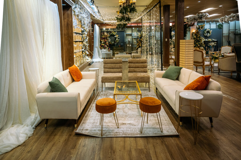
Belle Noel approaches commercial holiday decorating by looking at the existing environment first. Ceiling height, material finishes, lighting temperature, and architectural detail all inform what palette will feel balanced in that space.
A retail boutique with warm wood tones and soft lighting reads differently than a corporate lobby with polished concrete and cool overhead light. The holiday palette needs to respond to that context, not override it.
Starting with Neutral Does Not Mean Boring
For many businesses, a palette built on champagne, ivory, soft gold, or deep burgundy will feel more elevated than a traditional red and green approach. These tones sit closer to the existing environment and allow design elements like texture, proportion, and scale to carry the display.
This is where expertise matters. A neutral palette done well requires considered layering of materials, greenery, and light. Without that structure, it can feel flat. With it, the space feels complete.
When Traditional Colors Work
Traditional holiday colors are not wrong. They are wrong when they are applied without consideration for the space.
A children’s clothing boutique or a family entertainment venue can carry a bolder, more saturated palette because it aligns with the energy of the brand and the expectations of the guest. The palette choice should follow the experience you want to create, not a generic seasonal template.
How to Narrow Down Your Options
A few questions worth asking before committing to a direction:
- What materials already exist in the space? Warm wood, cool metal, stone, and glass each respond differently to color.
- What is the lighting temperature? Warm bulbs read differently than daylight or cool LEDs.
- What do your customers expect when they walk in? A luxury spa and a restaurant have different standards for seasonal expression.
- What does your brand look like in its best moments? The holiday display should feel like that.
These questions do not have a single right answer, but they narrow the range considerably. The goal is a palette that feels like a natural extension of the brand rather than a seasonal overlay.
Working with a Professional Makes This Clearer
Color decisions look different in swatches than they do at scale inside a real space. A palette that looks cohesive on paper can feel unbalanced once it is installed across a 3,000 square foot retail floor or a corporate lobby with 20-foot ceilings.
Belle Noel has been working with businesses across the DMV area since 2009. The consultation process starts with the environment, not a catalog. That distinction changes the result.
If you are planning your commercial holiday decorating this season, visit thebellenoel.com to explore how we approach the design process.
